
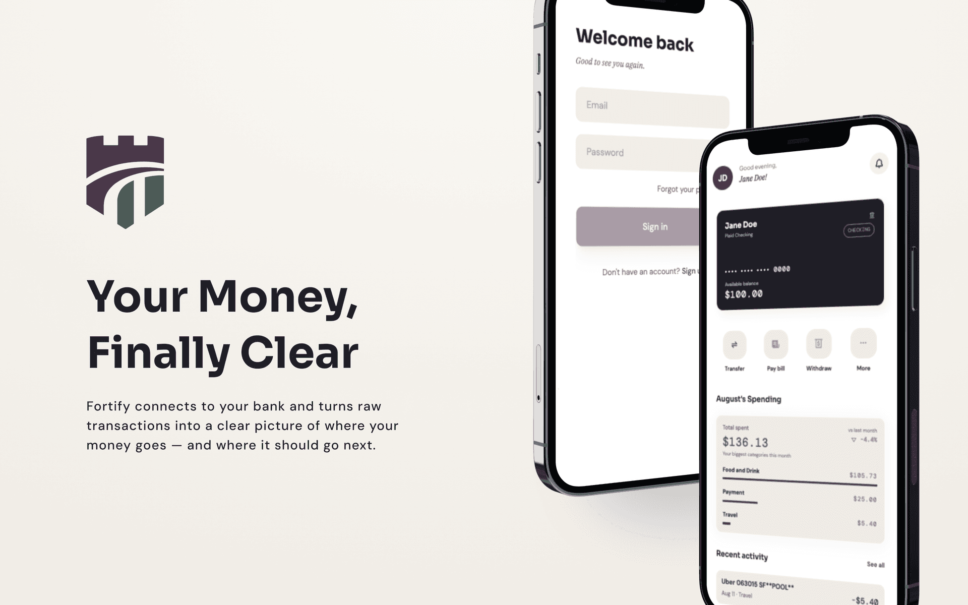
The template I started with — the iBank UI kit — was good. The screen structure, the information architecture, the overall flow: it gave the project a solid foundation to build on and let me stay focused on the engineering rather than designing from scratch. But as the app took shape, one thing became clear: the visual identity wasn't Fortify's. The template was light and playful — friendly in a way that works for a lot of consumer apps, but not for one called Fortify.
Since this project is partly a portfolio piece, "it works" wasn't enough. So I stopped building features and spent time on something I'd been putting off: building an actual design system rather than just picking colors and fonts as I went.
This post is about what that process looked like — the decisions behind the palette, the typography, the UX rules — and why each one was made deliberately rather than by default.
The Design Philosophy
The direction I landed on was premium but approachable. The iBank template is light and expressive, which works well for its intended audience. But Fortify needed something more restrained.
The visual language I set for the redesign: no decorative illustrations anywhere in the app. No blobs, no isometric graphics, no abstract shapes used as decoration. Personality would come entirely through typography and color. The only exceptions are the logo (which operates at brand-recognition scale, a different job than in-app UI) and product photography on the landing page.
That constraint sounds limiting but it's actually clarifying. When illustrations aren't available as a fallback for empty states, confirmation screens, or onboarding moments, you have to make the typography and color do that work properly. It forces the system to be coherent instead of relying on a graphic to cover gaps.
Functional icons — lock, chart, send, history — are still in the app because they're informational, not decorative. There's a real difference between an icon that communicates an action and a spot illustration that just fills space.
The Color System
The iBank template uses bright violet on white. The new palette keeps the light base but replaces the bright violet with something more considered, and brings in a set of semantic accent colors with specific jobs:
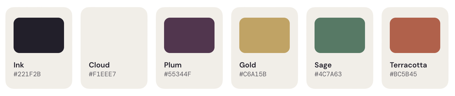
The warm neutrals (Paper, Cloud) came from wanting the app to feel less clinical. Pure white backgrounds read as sterile. A slightly warm off-white is barely noticeable consciously but changes the overall feel of the interface significantly.
Plum replaces the original bright violet as the brand primary — same color family, but deeper and more restrained. Gold as an accent was a deliberate move away from the standard fintech blue or green. It reads as premium without being ostentatious.
The WCAG AA Problem I Didn't Expect
Partway through the system work, I ran an accessibility audit against the token combinations I'd defined. Four of them failed WCAG AA contrast requirements — which for a banking application isn't just a best practice issue, it's a core usability issue. People need to be able to read their account balance.
The fixes fell into two categories:
Opacity correction: ink at 60% opacity was failing against light backgrounds. Bumping it to 70% brought it into compliance without a visible change in the design.
Text-specific variants: Gold, Sage, and Terracotta all failed when used as text colors against Paper and Cloud backgrounds. The decorative versions of those colors (used for icons, borders, and backgrounds) are fine as-is — the contrast requirements are different for UI elements versus text. But for text specifically, I needed darker variants:
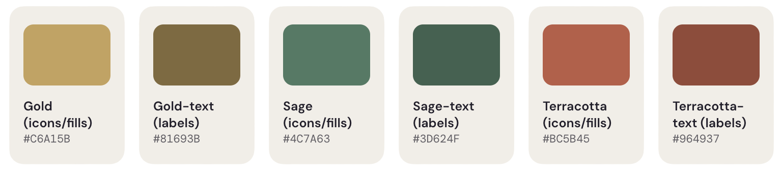
The distinction between the decorative token and the text token is intentional — if you swap them, things will look slightly off and you'll know something is wrong. The naming convention makes that explicit.
This is the kind of thing that doesn't show up when you're just picking colors that look good together. You have to test the actual combinations in context, and the results aren't always intuitive.
The Typography System
Four fonts, each with a specific job:
Sora — display and headlines. It has enough personality to anchor the brand without being difficult to read at larger sizes. Used for page titles, hero numbers, and section headers.
DM Sans — body copy and UI text. Clean, highly legible, neutral enough to stay out of the way. This is doing most of the work in the interface — labels, descriptions, navigation, body text.
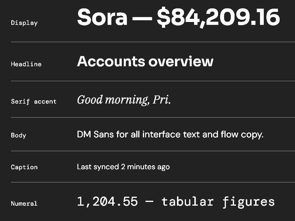
IBM Plex Serif italic — used sparingly, for greeting moments. The dashboard welcome message, confirmation screens, personalized copy. The contrast of a serif italic against a sans-serif interface creates a subtle warmth that an all-sans system doesn't have. The key word is sparingly — if it's everywhere, it stops being a moment.
DM Mono — every financial number in the app. Account balances, transaction amounts, transfer totals. All of them use tabular-nums and a monospaced font so digits align in columns regardless of value. This is a small detail that matters more than it seems — left-aligned financial numbers that shift around based on digit count look unprofessional and are genuinely harder to scan.
UX Decisions Worth Calling Out
A few changes to the screen flow that came out of the redesign process:
The home screen went from nine actions to four. The original layout had a 3×3 grid of action icons. Most of them were secondary features that didn't need to be front and center. The redesigned home screen surfaces four core actions — Transfer, Pay bill, Withdraw, More — with spending insights and recent activity as the primary content below. The information users actually want every time they open the app shouldn't be buried beneath a grid of icons.
Category spending bars have no track. An early version of the spending breakdown used progress-bar style indicators with a visible track — which implied a budget total that doesn't exist in the app. There's no budgeting feature yet. Showing a bar that reads as "X% of budget used" would be misleading. The bars are now proportional to the largest category shown rather than to any implied total. It's a subtle distinction that matters because financial UI has to be honest about what it's actually communicating.
Confirmation screens follow a consistent pattern. Success states use a sage checkmark. Error and expiry states use a terracotta clock. Every confirmation screen in the flow — welcome confirmation, password changed, link expired — uses this same visual language. The user doesn't have to interpret what the screen is telling them; the color and icon communicate it before they read the text.
No back button on entry-point screens. The sign-in screen has no back button because there's nowhere logical to go back to from there. Sign-up has a discard-progress modal if you try to navigate away mid-form — because abandoning a half-completed form without warning is a bad experience, and silently losing what someone has typed is worse.
What's Done and What's Next
The design system is implemented. The full authentication flow, home dashboard, card carousel, spending breakdown, and disconnected states are all built against the new tokens and typography rules. A landing page is live as well, which gave the brand system its first real test outside the app shell.
Guest mode is also complete — the fallback dashboard with dummy data that was still pending at the end of the auth refactor posts is built and working. That gets its own post.
Next up is security hardening before getting into the more complex feature work. After that, the plan is OAuth and two-factor authentication via Plaid — which will fold into the upcoming bank linking post and is a meaningful enough addition to change how that post gets written.
The series from here:
- Guest mode — what the fallback state looks like and how the dummy data is handled without leaking into the real data path
- Security — what was audited, what was hardened, and why it matters in a fintech context before going further
- Bank linking with Plaid — the OAuth flow, 2FA considerations, and what production adds on top of sandbox behavior
- Moving money with Dwolla
- Testing
- What's next